Page 1 of 1
[DVDpedia] Edit window aesthetics
Posted: Mon Jul 13, 2009 3:42 pm
by sjk
Here's an example of how the appearance of DVDpedia's Edit window might be improved.
In
another thread I asked:
Any reason more of the interface elements (menus, boxes, etc.) in the Edit window (at least) aren't more Aqua-looking/behaving, like in this KavaMovies screenshot?
And Conor's response was:
It allows us to be more flexible, show more information in less space and allow the customization of the field order and tab location.
I still don't understand why the fields couldn't look more like this (Dvd Hunter's Info window):

The fields/values are clearly more distinctive than in DVDpedia:

Also, Dvd Hunter's buttons and navigation tabs look nicer (and more familiar) to me.
DVDpedia is the superior app for me as far as functionality and performance but it might consider borrowing some appearance tips from at least Dvd Hunter and KavaMovies (just two apps that happened to be convenient for comparison).
Re: [DVDpedia] Edit window aesthetics
Posted: Wed Jul 15, 2009 12:46 am
by live4ever
That's how the old DVDpedia used to look like, (pre-3.0 or pre-4.0??) I personally have always liked how Address Book.app edit mode works where you can set the preferences to show default fields and how adding custom fields works.
Re: [DVDpedia] Edit window aesthetics
Posted: Wed Jul 15, 2009 2:55 am
by sjk
live4ever wrote:That's how the old DVDpedia used to look like, (pre-3.0 or pre-4.0??)
D'oh!

Thanks for telling me.
I'm sure interested to know why it was changed. The current style could be an improvement for
displaying information but I'd prefer the other style for its primary purpose of
editing information. Part of the trouble is the input focus seems to unpredictably change depending on previous editing/navigation. That might be easier to show examples with screen recordings than trying to describe.
I personally have always liked how Address Book.app edit mode works where you can set the preferences to show default fields and how adding custom fields works.
Address Book is a peculiar example; the same UI pane is used for editing
and displaying information. DVDpedia has the separate Edit window for editing (input) and the Info pane in the main window for displaying (output). Hmm, I hadn't really considered that input/output differentiation earlier.
Anyway, the current combination of the Edit window's appearance
and functionality doesn't look/feel comfortable to me.
Re: [DVDpedia] Edit window aesthetics
Posted: Wed Jul 15, 2009 3:21 pm
by thajeztah
I think that what Connor is trying to explain is (please correct me if I'm wrong, as I'm not sure I'm right) that the 'default' Aqua inputs cannot be organized 'dynamically'; i.e. it's not possible to change the order of fields in your preferences (and probably won't support the 'autocomplete' function).
Bruji uses the 'building blocks' (interface elements), supplied by Apple in the developers kit, to create the edit-page. The default Aqua interface-elements to create a form can only have a 'fixed' position. To enable re-organizing the order of the input-fields, Bruji probably uses a plug-in (library), not created by Apple, which has extra features (dynamically set the order of the fields), but has a different 'look' on the downside.
This being said, I also prefer the default Aqua look. Makes me feel more 'at home' on my Mac

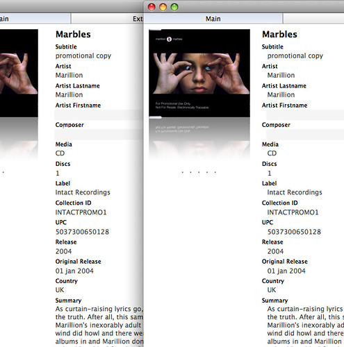
One idea (comments please); Is it easier on the eye if the labels are aligned with the text-fields?
I created a quick mock-up left-side is modified (labels aligned), right side is original

Re: [DVDpedia] Edit window aesthetics
Posted: Wed Jul 15, 2009 4:18 pm
by Alex
The problem with the mock up you have is that since both fields use the same font, it is quite hard (visually speaking) to determine which is the title and which is the content. Aesthetically it might look nicer, but it suffers in readability. We might need to visually separate the title from the content somehow, but I'm not sure how customizable that is right now.
Re: [DVDpedia] Edit window aesthetics
Posted: Wed Jul 15, 2009 4:21 pm
by thajeztah
Yeah, I thought the same when I finished the mockup; It's cleaner on one hand, but less readable on the other. Maybe some extra space between fields will improve readability, but will also take up more space.
I'll have a look around in other applications, maybe I find some ideas elsewhere. Will let you know if I do

Re: [DVDpedia] Edit window aesthetics
Posted: Wed Jul 15, 2009 5:22 pm
by sjk
thajeztah wrote:I think that what Connor is trying to explain is (please correct me if I'm wrong, as I'm not sure I'm right) that the 'default' Aqua inputs cannot be organized 'dynamically'; i.e. it's not possible to change the order of fields in your preferences (and probably won't support the 'autocomplete' function). […]
That makes sense, e.g. supporting this:

… and corresponding dynamic adjustments in the Edit window.
This being said, I also prefer the default Aqua look. Makes me feel more 'at home' on my Mac

Yup. I'm mostly satisfied with DVDpedia's look/feel and my comments/suggestions about it certainly don't intend to offend Bruji.

One idea (comments please); Is it easier on the eye if the labels are aligned with the text-fields?
I created a quick mock-up left-side is modified (labels aligned), right side is original
I prefer it the way it is now because it helps more clearly differentiate field names from their values. [Edit: And what Alex posted about fonts while I'm still writing this] But I wouldn't mind if empty value fields had a darker background than this:

Or, more like the DVD Hunter look (if possible) for
editing purposes. The current look seems more oriented for
display purposes.
Thanks for the feedback!
Re: [DVDpedia] Edit window aesthetics
Posted: Mon Jul 20, 2009 10:19 am
by witchkitten
I'd just like to add that I like the DVD Hunter/Pedia pre-4.0 editing window better too. As I mentioned in another post, until I got my iphone last month and was forced to switch to use pocketpedia, I never upgraded from 3.6 or whatever the last version was because of the edit view. It's so much harder to see all of the information in the new version and I struggle to find the fields I want whereas it was very easy in the old version (although the new version is much prettier). Also, I liked that in the old version I was able to see all of the fields in the editing window without having to make the window huge. That's just my opinion. I still love the pedias though.
Re: [DVDpedia] Edit window aesthetics
Posted: Sun Jan 08, 2012 3:51 pm
by joel
I agree.
The DVDpedia details and edit pages are hard to read and hard on the eyes.
I find myself searching for for fields and it almost makes my head hurt - it is a strange feeling, as I hunt for a field, it is hard to determine what is a a label, what is data, and what is empty.
It would also be nice to give it some structure and form, so related fields are next to each other and the layout optimizes field spacing.
But then you give up the customization...
Not sure what the answer is, but if some of the visuals could be improved: fonts, formatting, size, shading it might help.
Functionality, and most of the other interface elements, the program rocks.


